One of the most effective ways to lead the visual attention of viewers through your web portal to the important information, especially for fashion businesses, is to use accent colour schemes on the website in the right way.
by Apparel Resources 21-January-2021 | 9 mins read
One of the most effective ways to lead the visual attention of viewers through your web portal to the important information, especially for fashion businesses, is to use accent colour schemes on the website in the right way. While traditionally designers create their own colour schemes and then pick the right combinations physically, many web softwares and apps are today being evolved to cut time. Let’s have a look at some of the key colour trends and popular options available today.
As per the latest remarks by experts from Pantone Color Institute for 2020-2021, Autumn/Winter colour trends in New York Fashion Week reverberated classic seasonal hues imbued with disposition, with interest in desirable personality. Speaking on the same, the Executive Director of the Pantone Color Institute, Leatrice Eiseman says “Imbued with strength and personality, colours for Autumn/Winter 2020-21 encourage our ongoing desire for unique self-expression through creative and unusual visual statements that stand out.”
“Offering a rich narrative, the colour palette for Autumn/Winter 2020-21 highlights our desire for versatile, timeless colour. Reflecting a ‘less is more’ mindset that is becoming increasingly important to consumers prioritising value and functionality, our colour palette is stripped of excess,” Eiseman says.
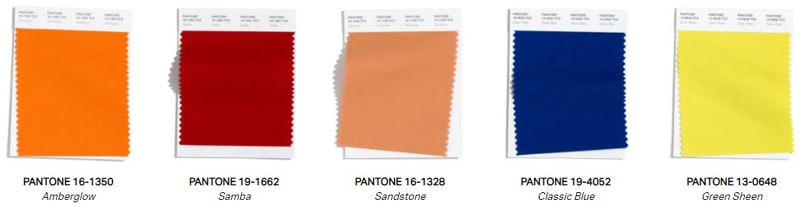
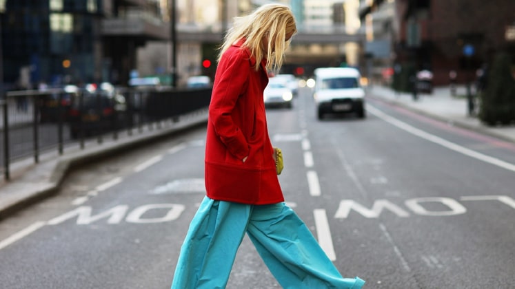
While specific colours lend themselves to unique statements, the timelessness and usage versatility of these colours are seen to convey a relevance to functionality as well. The Pantone 16-1350, Amberglow is described by Pantone as “A radiant autumnal orange, Amberglow promotes self-confidence and creative self-expression.” Similarly, Samba, Pantone 19-1662 has been beautified as “A voluptuous sultry red” introducing an upbeat energy. Pantone 16-1328, or the Sandstone, is demonstrated as “Tied to nature, earthy Sandstone speaks of the rustic outdoors”.
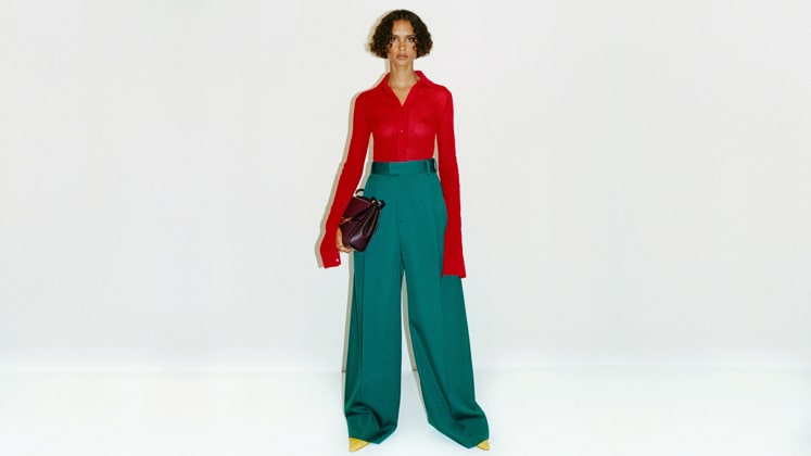
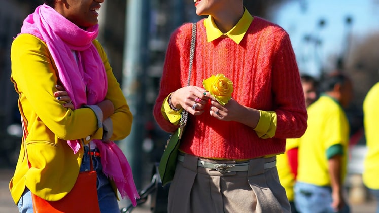
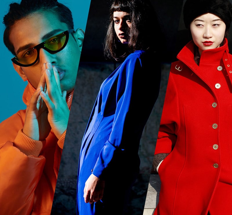
Reflecting the changing demands and energetic mindset of today’s consumer, the new colour scheme encourages pragmatism, enthusiasm as well as creativity, thereby prioritising value and lifetime of the colour options that are available today and disappear the next moment. It is evident that modern designers are taking bold decisions to translate their designs into reality through single dominant colours. To bring out more of an emotional impact on the eyes of viewers, colour psychology has been a go-to attraction for designers. Moreover, the 2021 collections are observed with acidic yellow shade, cyan, tomato, maroon and tangerine which give a throw into trends from last decade.
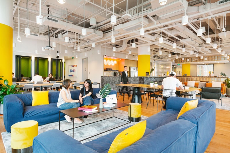
Apart from runways, colour scheme is an important part of website design also these days. What exactly a web colour scheme means can be better understood with the help of the colour wheel. Colours which complement when placed together can be found at opposing positions in the colour wheel. For example, the website of WeWork uses bright orange and blue, carefully amalgamated to create an accent that is eye catchy. The technique of selecting colours in an attractive manner that conveys the core value of a brand is called colour harmony, a key guide to web designers.
As a generally accepted fact, complementary colours should not be used in text. Today there are several advanced tools being used to understand the psychology of customers through scrutiny. Parag Amodkar, Senior Manager, South Asian region, Tobii Pro (an advanced tech giant based in Sweden), says, “Colours of products/brands heavily represent the AutoPilotness in consumer’s mind; neuroscientific techniques like eye tracking are used to document these and also help new brands plan their designs.”
The technology applied to website health evaluation works at capturing visual attention of viewers, which lets the brand have an idea of how users engage with the website. “Attractiveness and Engagement- two measures derived from visual behaviour data, are effectively used during consultations by Tobii Pro,” Parag adds.
Also Read: Revival of fashion industry demands digitisation
Colour is so powerful, it can drive or ruin the conversion of visitors to shoppers, be it in a store or on a website. Who doesn’t know about the red-green colour- blindness of Founder Mark Zuckerberg, as the reason behind blue colour of Facebook icon? He once stated, “Blue is the richest colour for me; I can see all of blue.” Nevertheless, Blue is associated with the emotion of trust, calmness and friendliness. Selecting right colours and reinventing the colour wheel is a time-consuming process for modern day designers. But there are hundreds of software that are being used to create new schemes some of which are listed below:
1. Color Safe
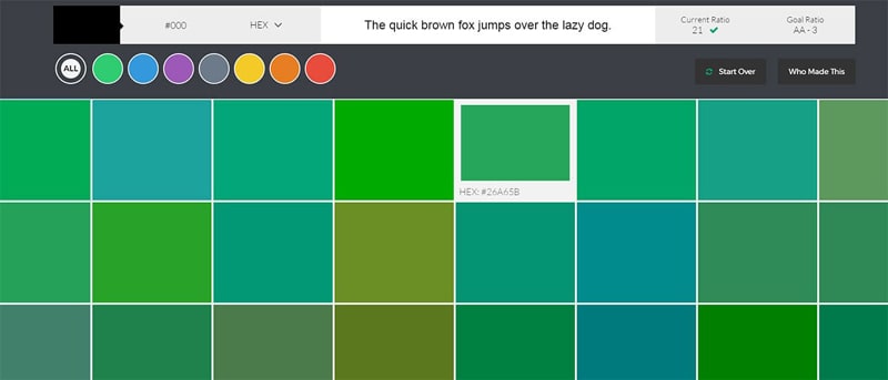
This web application is one of the best tools for those concerned for the WCAG in design process. Color Safe application generates colour schemes which blend as desired by the user, contrast well up to the guidelines of WCAG. Also, this app comes with a W3 Rulebook, a platform where one can select from hundreds of colour options with higher contrast and better readability.
2. Paletton
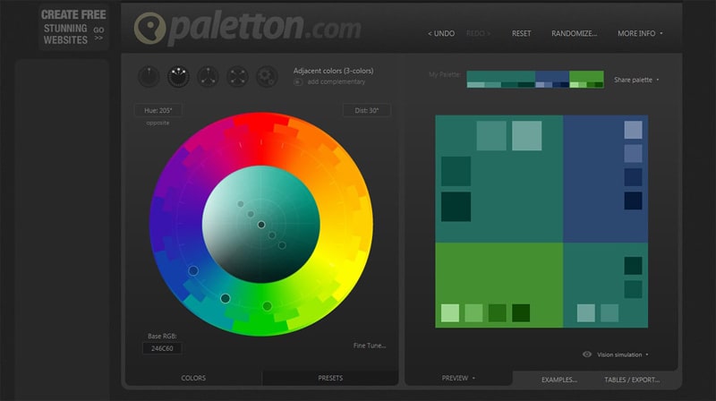
A classic for major portion of designers out there, Paletton, earlier named as Color scheme Designer, is a software application that gives freedom to combine colours and pick from vast number of options. Simply, the designer feeds a seed colour, or the base colour, and the app generates a range of colour combinations and similar colour alternatives that complement well. Paletton app leads the users well through, to build customised colour palette for designs on the basis of five different styles – namely Free Style, Tetrad, Triad, Complement, and Mono.
3. COPASO
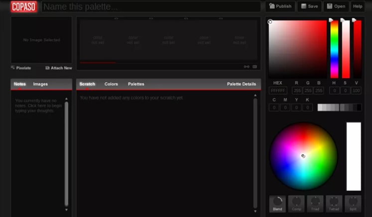
COPASO, an advanced colour palette creating tool by ColourLovers creative community, has been a favourite software application for web designers. It is known for its one-stop user-experience interface that lets user create desired colour schemes by either of the three methods- image upload, colour choices or feeding HEX or CMYK code values. Once the colour palette is saved and published, the designer also has the option for handy notes at their side
4. Colors
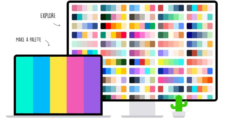
A truly innovative and out of the box colour palette generator application which gives you flexibility to create perfect colour blends for the designs, pick your favourite palette using image, make creatives; they even have options for colour blindness. One of the most interesting features is the use of spacebar key to generate a new palette every time. You can search through the spacebar multiple times until you find the right colour bar key.